GOALS
REGIONAL COLLABORATION
Helping counties, cities, towns and communities work together to improve the region.
ACCESS FUNDING & SERVICES
Connecting individuals, groups and communities with essential services and funding opportunities.
FACILITATE SOLUTIONS
Bringing together partners to solve problems as unbiased facilitators.
ADVOCATE FOR LOCAL ISSUES
Make local concerns regionally relevant.
CORE VALUES
Trustworthy
Responsive
Efficient
Knowledgeable
MISSION STATEMENT
Wasatch counties.
TAGLINE
MAG PRIMARY LOGO
- When the logo is used in grayscale format, the typeface treatment remains the same while the grays in the icon are arranged to emulate the color version of the icon.
- When the logo needs to appear on a color background, the reversed-out version can be used in the treatment shown to the right utilizing various shades of the primary brand blue.
- When the logo needs to appear on a black or dark background, a 90% black background is preferred when available while the typeface is reversed in white with the icon utilizing shades of black that emulate the color values of the full color version.
- Logo should be used with tagline in all possible scenarios other than when “tagline readability” is an issue or the tagline is being used as a reinforced marketing message on the accompanying materials and it becomes repetitive.

HORIZONTAL LOGO WITH TAGLINE

GRAYSCALE HORIZONTAL LOGO

HORIZONTAL LOGO NO TAGLINE

STACKED LOGO WITH TAGLINE

GRAYSCALE STACKED LOGO WITH TAGLINE

STACKED LOGO NO TAGLINE
Logo Usage
MAG’s unique and important function is helping constituent cities, counties, and agencies reach across boundaries. This is their unifying function. The proposed logo illustrates how MAG connects and reaches across boundaries. The “M” with a intersecting line creates forward and back arrows that remind viewers that MAG learns from the past to make decisions about the future.
The typeface utilized in the mark is based on the Gotham family with custom manipulation to some of the letter forms themselves to further distinguish the brand identity typestyle. To maintain the logo’s integrity, always use the original artwork supplied and adhere to the following guidelines when using the logo type:
- Wherever possible, our logo should be reproduced in the specified brand colors.
- To ensure the logotype stands out and remains uncrowded, always leave a clear space that is approximately 1/2 the width of the icon (shown to the right) around the logotype). This area should be kept clear of any graphic elements (including obstructive elements of a photographic background). This clearspace is built into the original artwork.
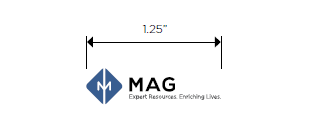
- To maintain the integrity of the logo, a minimum print size has been determined for the logo of 1.25 inches.
The logotype can be positioned in any corner or be centered top, middle or bottom of a page or screen. The logotype should never be closer to the edge of a document than 1/2” minimum.
Division logos are available upon request.


COLOR PALETTE
The MAG color palette offers several distinct cool colors with orange to balance as a complement. This is supported by two shades of gray and a rich black to paint the brand.
To accommodate the brand color palette there are specific RGB, CMYK, and Pantone Values assigned to each individual color. This should be used to maintain brand consistency across all mediums and platforms.
The light blue and MAG orange are available for use as additional accent colors to add subtle visual variation to materials or website but should never be utilized as a main or dominant color.
LIGHT BLUE
PANTONE 2381
#5e93db
C = 61
M = 29
Y = 0
K = 0
R = 94
G = 147
B = 219
MAG BLUE
PANTONE 7683
#385d90
C = 73
M = 47
Y = 0
K = 31
R = 56
G = 93
B = 144
MAG ORANGE
PANTONE 7580
#c7501a
C = 0
M = 77
Y = 97
K = 15
R = 192
G = 81
B = 49
60% BLACK
#808285
C = 0
M = 0
Y = 0
K = 60
R = 128
G = 130
B = 133
80% BLACK
#58595b
C = 0
M = 0
Y = 0
K = 80
R = 88
G = 89
B = 91
BLACK
#000000
C = 50
M = 50
Y = 50
K = 100
R = 0
G = 0
B = 0
60% BLACK
#808285
C = 0
M = 0
Y = 0
K = 60
R = 128
G = 130
B = 133
80% BLACK
#58595b
C = 0
M = 0
Y = 0
K = 80
R = 88
G = 89
B = 91
BLACK
#000000
C = 50
M = 50
Y = 50
K = 100
R = 0
G = 0
B = 0
OPEN SANS
Typography unifies our corporate identity by adding consistency and continuity. It is important to apply our corporate typeface to all written communications in the letterforms’ original format. Don’t extend, condense or skew the letterform in any way.
MAG’s primary typeface is Opens Sans. Open Sans’s regular setting should be suitable for most applications, where Open Sans Bold will be appropriate to add emphasis.
Open Sans Light is suitable for headings.
Open Sans: Light
AaBbCcDdEeFfGgHhIiJjKkLlMmNnOoPpQqRr
SsTtUuVvWwXxYyZz 1234567890
Open Sans: Regular
AaBbCcDdEeFfGgHhIiJjKkLlMmNnOoPpQqRr
SsTtUuVvWwXxYyZz 1234567890
Open Sans: Italic
AaBbCcDdEeFfGgHhIiJjKkLlMmNnOoPpQqRr
SsTtUuVvWwXxYyZz 1234567890
Open Sans: Bold
AaBbCcDdEeFfGgHhIiJjKkLlMmNnOoPpQqRr
SsTtUuVvWwXxYyZz 1234567890
Open Sans: Bold Italic
AaBbCcDdEeFfGgHhIiJjKkLlMmNnOoPpQqRr
SsTtUuVvWwXxYyZz 1234567890